Header buttons
Now that we know how to customize the look of our headers, let's make them interactive!
Adding a button to the header
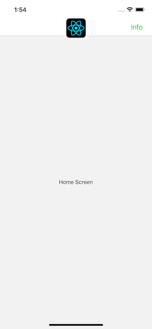
The most common way to interact with a header is by tapping a button to the left or right of the title. Let's add a button to the right side of the header:
- Static
- Dynamic
const MyStack = createNativeStackNavigator({
  screens: {
    Home: createNativeStackScreen({
      screen: HomeScreen,
      options: {
        headerRight: () => (
          <Button onPress={() => alert('This is a button!')}>Info</Button>
        ),
      },
    }),
  },
});
const Stack = createNativeStackNavigator();

function MyStack() {
  return (
    <Stack.Navigator>
      <Stack.Screen
        name="Home"
        component={HomeScreen}
        options={{
          headerRight: () => (
            <Button onPress={() => alert('This is a button!')}>Info</Button>
          ),
        }}
      />
    </Stack.Navigator>
  );
}
When we define our button this way, you can't access or update the screen component's state in it. This is pretty important because it's common to want the buttons in your header to interact with the screen that the header belongs to. So, we will look how to do this next.
Header interaction with its screen component
To make header buttons interact with screen state, we can use navigation.setOptions inside the screen component:
- Static
- Dynamic
function HomeScreen() {
  const navigation = useNavigation('Home');
  const [count, setCount] = React.useState(0);

  React.useEffect(() => {
    // Use `setOptions` to update the button that we previously specified
    // Now the button includes an `onPress` handler to update the count
    navigation.setOptions({
      headerRight: () => (
        <Button onPress={() => setCount((c) => c + 1)}>Update count</Button>
      ),
    });
  }, [navigation]);

  return <Text>Count: {count}</Text>;
}

const MyStack = createNativeStackNavigator({
  screens: {
    Home: createNativeStackScreen({
      screen: HomeScreen,
      options: {
        // Add a placeholder button without the `onPress` to avoid flicker
        headerRight: () => <Button>Update count</Button>,
      },
    }),
  },
});
function HomeScreen() {
  const navigation = useNavigation('Home');
  const [count, setCount] = React.useState(0);

  React.useEffect(() => {
    // Use `setOptions` to update the button that we previously specified
    // Now the button includes an `onPress` handler to update the count
    navigation.setOptions({
      headerRight: () => (
        <Button onPress={() => setCount((c) => c + 1)}>Update count</Button>
      ),
    });
  }, [navigation]);

  return <Text>Count: {count}</Text>;
}

const Stack = createNativeStackNavigator();

function MyStack() {
  return (
    <Stack.Navigator>
      <Stack.Screen
        name="Home"
        component={HomeScreen}
        options={{
          // Add a placeholder button without the `onPress` to avoid flicker
          headerRight: () => <Button>Update count</Button>,
        }}
      />
    </Stack.Navigator>
  );
}
Here we update headerRight with a button that has onPress handler that can access and update the component's state, since it's defined inside the component.
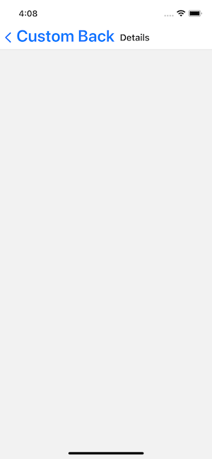
Customizing the back button
The back button is rendered automatically in a stack navigator whenever there another screen to go back to.
The native stack navigator provides platform-specific defaults for this back button. On older iOS versions, this may includes a label next to the button showing the previous screen's title when space allows.
You can customize the back button using various options such as:
headerBackTitle: Change the back button label (iOS)headerBackTitleStyle: Style the back button labelheaderBackIcon: Custom back button icon
- Static
- Dynamic
const MyStack = createNativeStackNavigator({
  screens: {
    Home: {
      screen: HomeScreen,
      options: {
        headerBackTitle: 'Custom Back',
        headerBackTitleStyle: { fontSize: 30 },
      },
    },
  },
});
const Stack = createNativeStackNavigator();

function MyStack() {
  return (
    <Stack.Navigator>
      <Stack.Screen
        name="Home"
        component={HomeScreen}
        options={{
          headerBackTitle: 'Custom Back',
          headerBackTitleStyle: { fontSize: 30 },
        }}
      />
    </Stack.Navigator>
  );
}
If you want to customize it beyond what the above options allow, you can use headerLeft to render your own component instead. The headerLeft option accepts a React Component, which you can use to override the onPress behavior or replace the button entirely. See the API reference for details.
Summary
- Buttons can be added to the header using
headerLeftandheaderRightinoptions - The back button can be customized with
headerBackTitle,headerBackTitleStyle,headerBackIcon, or replaced entirely withheaderLeft - To make header buttons interact with screen state, use
navigation.setOptionsinside the screen component