Configuring the header bar
We've seen how to configure the header title already, but let's go over that again before moving on to some other options.
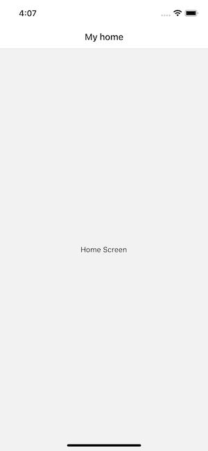
Setting the header title
Each screen has an options property (an object or function returning an object) for configuring the navigator. For the header title, we can use the title option:
- Static
- Dynamic
const MyStack = createNativeStackNavigator({
  screens: {
    Home: {
      screen: HomeScreen,
      options: {
        title: 'My home',
      },
    },
  },
});
const Stack = createNativeStackNavigator();

function MyStack() {
  return (
    <Stack.Navigator>
      <Stack.Screen
        name="Home"
        component={HomeScreen}
        options={{
          title: 'My home',
        }}
      />
    </Stack.Navigator>
  );
}
Using params in the title
To use params in the title, make options a function that returns a configuration object. React Navigation calls this function with { navigation, route } - so you can use route.params to access the params:
- Static
- Dynamic
const MyStack = createNativeStackNavigator({
  screens: {
    Home: {
      screen: HomeScreen,
      options: {
        title: 'My home',
      },
    },
    Profile: {
      screen: ProfileScreen,
      options: ({ route }) => ({
        title: route.params.name,
      }),
    },
  },
});
const Stack = createNativeStackNavigator();

function MyStack() {
  return (
    <Stack.Navigator>
      <Stack.Screen
        name="Home"
        component={HomeScreen}
        options={{
          title: 'My home',
        }}
      />
      <Stack.Screen
        name="Profile"
        component={ProfileScreen}
        options={({ route }) => ({
          title: route.params.name,
        })}
      />
    </Stack.Navigator>
  );
}
The argument that is passed in to the options function is an object with the following properties:
navigation- The navigation object for the screen.route- The route object for the screen
We only needed the route object in the above example but you may in some cases want to use navigation as well.
Updating options with setOptions
We can update the header from within a screen using navigation.setOptions:
- Static
- Dynamic
<Button
  onPress={() =>
    navigation.setOptions({ title: 'Updated!' })
  }
>
  Update the title
</Button>
<Button
  onPress={() =>
    navigation.setOptions({ title: 'Updated!' })
  }
>
  Update the title
</Button>
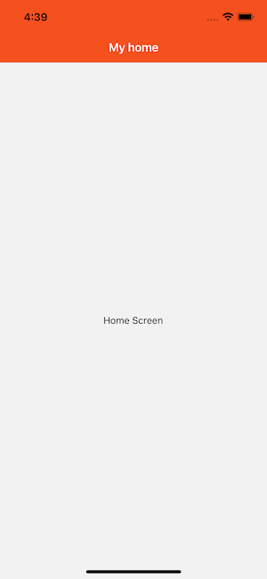
Adjusting header styles
There are three key properties to use when customizing the style of your header:
headerStyle: A style object that will be applied to the view that wraps the header. If you setbackgroundColoron it, that will be the color of your header.headerTintColor: The back button and title both use this property as their color. In the example below, we set the tint color to white (#fff) so the back button and the header title would be white.headerTitleStyle: If we want to customize thefontFamily,fontWeightand otherTextstyle properties for the title, we can use this to do it.
- Static
- Dynamic
const MyStack = createNativeStackNavigator({
  screens: {
    Home: {
      screen: HomeScreen,
      options: {
        title: 'My home',
        headerStyle: {
          backgroundColor: '#f4511e',
        },
        headerTintColor: '#fff',
        headerTitleStyle: {
          fontWeight: 'bold',
        },
      },
    },
  },
});
const Stack = createNativeStackNavigator();

function MyStack() {
  return (
    <Stack.Navigator>
      <Stack.Screen
        name="Home"
        component={HomeScreen}
        options={{
          title: 'My home',
          headerStyle: {
            backgroundColor: '#f4511e',
          },
          headerTintColor: '#fff',
          headerTitleStyle: {
            fontWeight: 'bold',
          },
        }}
      />
    </Stack.Navigator>
  );
}
There are a couple of things to notice here:
- On iOS, the status bar text and icons are black by default, which doesn't look great over a dark background. We won't discuss it here, but see the status bar guide to configure it.
- The configuration we set only applies to the home screen; when we navigate to the details screen, the default styles are back. We'll look at how to share
optionsbetween screens next.
Sharing common options across screens
Often we want to apply the same options to all screens in a navigator. Instead of repeating the same options for each screen, we can use screenOptions on the navigator.
- Static
- Dynamic
const MyStack = createNativeStackNavigator({
  screenOptions: {
    headerStyle: {
      backgroundColor: '#f4511e',
    },
    headerTintColor: '#fff',
    headerTitleStyle: {
      fontWeight: 'bold',
    },
  },
  screens: {
    Home: {
      screen: HomeScreen,
    },
    Details: {
      screen: DetailsScreen,
    },
  },
});
const Stack = createNativeStackNavigator();

function MyStack() {
  return (
    <Stack.Navigator
      screenOptions={{
        headerStyle: {
          backgroundColor: '#f4511e',
        },
        headerTintColor: '#fff',
        headerTitleStyle: {
          fontWeight: 'bold',
        },
      }}
    >
      <Stack.Screen name="Home" component={HomeScreen} />
      <Stack.Screen name="Details" component={DetailsScreen} />
    </Stack.Navigator>
  );
}
All screens in this navigator will now share these styles. Individual screens can still override them in their own options.
Replacing the title with a custom component
Sometimes you need more control than changing the text and styles of your title -- for example, you may want to render an image in place of the title, or make the title into a button. In these cases, you can completely override the component used for the title and provide your own.
- Static
- Dynamic
function LogoTitle() {
  return (
    <Image
      style={{ width: 50, height: 50 }}
      source={require('@expo/snack-static/react-native-logo.png')}
    />
  );
}

const MyStack = createNativeStackNavigator({
  screens: {
    Home: {
      screen: HomeScreen,
      options: {
        headerTitle: (props) => <LogoTitle {...props} />,
      },
    },
  },
});
function LogoTitle() {
  return (
    <Image
      style={{ width: 50, height: 50 }}
      source={require('@expo/snack-static/react-native-logo.png')}
    />
  );
}

const Stack = createNativeStackNavigator();

function MyStack() {
  return (
    <Stack.Navigator>
      <Stack.Screen
        name="Home"
        component={HomeScreen}
        options={{
          headerTitle: (props) => <LogoTitle {...props} />,
        }}
      />
    </Stack.Navigator>
  );
}
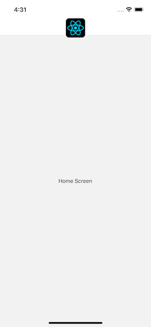
headerTitle is header-specific, while title is also used by tab bars and drawers, or as page title on web. headerTitle defaults to displaying the title in a Text component.
Additional configuration
See the full list of header options in the createNativeStackNavigator reference.
Summary
- Headers can be customized via the
optionsproperty on screens - The
optionsproperty can be an object or a function that receives thenavigationandrouteobjects - The
screenOptionsproperty on the navigator can be used to apply shared styles across all screens